Skip to content
← Back to Work

Product Design · Interaction Design · 3D Web · Frontend Development

MyMuseum

Turning online art portfolios into spaces people can actually walk through.

Live

I designed and built a web platform that turns an artist's uploads into a walkable 3D museum, with a Grid View so every visitor can reach the work. Shared multiplayer presence is built and in testing.

Build Your Own Museum →

Tools: Figma, Next.js, React Three Fiber, Claude Code, Blender

Role
Solo Product Designer + Developer
Duration
3 months
Platform
Web

The problem

Online portfolios flatten art into grids and feeds, losing the scale, depth, and sequence the work depends on.

I built MyMuseum to test whether an artist's work could be walked through like a gallery instead — then asked five artists whether that's something they actually want.

Design challenge

What if an art portfolio felt like entering someone's world?

Research

Testing the idea with artists, after the first build

In September 2026, after the first build, I interviewed five artists remotely (30–45 minutes each): three professionals reached through Instagram and Cara (P1, oil painter; P2, concept artist; P3, 3D sculptor) and two U-M Stamps students (P4, narrative illustrator; P5, ceramicist). Each session covered how they show their work today, then their reactions to concept wireframes of 3D vs. grid navigation and automatic room setup.

No one used the live product, so these interviews aren't usability tests of MyMuseum.

Key findings

01

Flat images lose what makes the work matter

What artists said

On a phone, P1's six-foot canvas looks the same size as a ten-inch sketch, without its texture or varnish. P3 loses a sculpture's depth and silhouette in a single JPEG. P4 watches feeds scramble a continuous series.

What the build covers — and doesn’t

Confirmed: a walkable gallery that hangs each piece at its original proportions. Gap: real-world scale, 3D model viewing, and a creator-set order.

02

Immersion can't cost access

What artists said

P1 expects older collectors to close the tab if they meet game-style controls. P2 wants no virtual building at all — an art director gives a portfolio about thirty seconds. Even P3, the strongest case for 3D, worries a slow gallery on a midrange phone makes the work look broken.

What the build covers — and doesn’t

Confirmed: Grid View with the same artwork viewer, first on touch devices. Gap: artwork zoom and measured load performance.

03

Publishing has to take minutes, not an afternoon

What artists said

P2 hadn't updated their site in about nine months — if publishing takes more than a couple of minutes, it doesn't happen. P5 cancelled a paid site builder; the monthly fee made no sense for occasional pottery sales.

What the build covers — and doesn’t

Confirmed: upload, pick a theme, and the gallery lays itself out. Gap: mobile-first creator tools and links to existing shops.

I also reviewed New Art City, an existing virtual-gallery platform.

01

New Art City

What worked

  • Recent Exhibitions and Events & Openings give visitors two ways to discover artists.
  • Built-in chat gives exhibitions a sense of social presence.

Where it fell short

  • Open-ended building tools trade visitor navigation for creator freedom — finding a specific piece can take real exploration.
  • Feels more like a professional creative workspace than a place to just upload work.

What it meant for MyMuseum

Social, browser-based exhibitions work — but creator freedom shouldn't cost visitors the ability to find the work.

Opportunity

Make creating a virtual gallery feel less like designing an exhibition and more like uploading a portfolio.

Define

Designing for both sides of the museum

Artists (P1–P5)

Want people to experience their work as it really is, without building a website to get there.

  • Show scale, surface, and depth (P1, P3)
  • Keep a series in sequence (P4)
  • Publish in minutes (P2)
  • Free to run, managed from a phone (P5)

Their visitors

Collectors and art directors, as the artists described them. I haven't interviewed visitors directly.

  • No game-style controls (P1)
  • Judge work in about thirty seconds (P2)
  • Crisp detail, fast loading (P2, P3)
  • An obvious way to reach the artist (P2)

The interviews pulled in two directions: P3 and P4 wanted more atmosphere, P2 wanted none, and P1 wanted both — a painting's presence without the controls.

How might we

How might I give artists enough freedom to make a museum feel like their own without sacrificing navigation and accessibility for visitors?

Ideation

Mapping the two experiences

Two journeys had to work together: creating a museum and exploring one.

Creator flow

Goal: as little distance as possible between uploading artwork and having something worth sharing.

Visitor flow

Goal: keep spatial discovery without making 3D navigation a requirement.

Key decisions

Three decisions that shaped MyMuseum

Each resolves part of the HMW above, and each gave something up. The core of all three was built before the interviews, so artists' comments appear as later evidence, not as their origin.

Decision 01 · Freedom vs. structure

Make creating a museum feel like uploading a portfolio

The problem

Full spatial freedom means learning exhibition design, and risks layouts visitors can't navigate.

Evidence

  • Competitive analysisNew Art City's open-ended building tools cost visitors navigation and felt like a professional workspace.
  • My own testingOnce a museum was generated, creators had no way back in to fix a typo, swap a piece, or change its visibility.
  • Artist interviews · after buildPublishing speed was the clearest shared need (P2, P5) — the work automatic layout already removes.

Decision

Generate the spatial layout automatically. Creators control their artwork, gallery style, museum details, visibility, and identity — and can come back to edit any of it. Adding or removing a piece re-runs the layout instead of asking them to place it.

Tradeoff
Artists can't hand-place work or design their own rooms. I gave up some expressiveness so every museum stays navigable and no one has to learn exhibition design.
Outcome
Built: creators never place anything by hand, and the gallery re-lays itself out whenever artwork is added or removed.

The creator flow this produced

Add museum details
Upload artwork
Choose gallery style
Generate museum
Preview
Publish & copy link
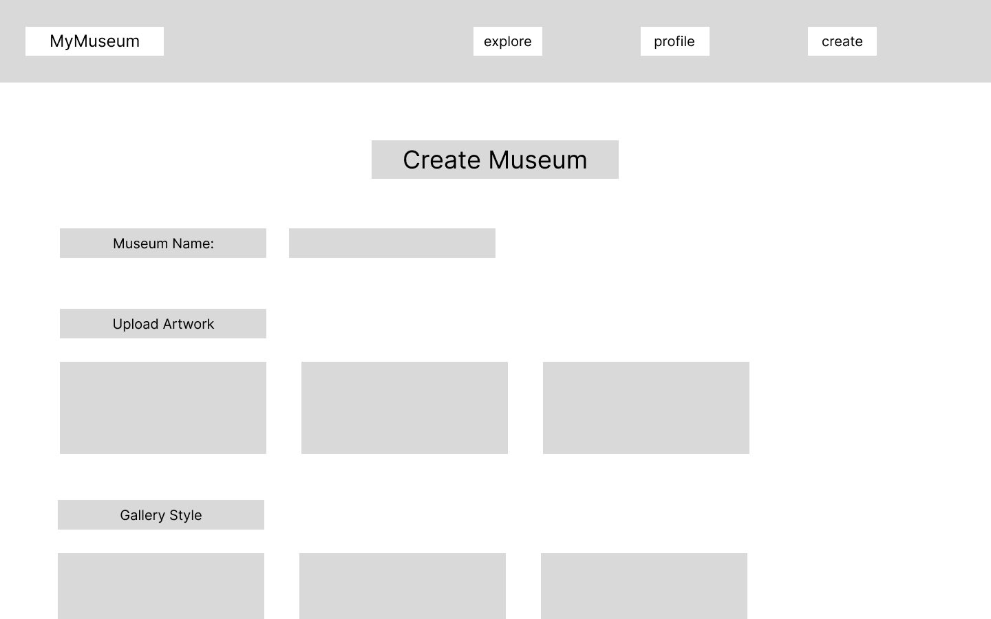
Lo-fi wireframe of Create Museum: a museum name field, an Upload Artwork area, and a Gallery Style picker — no step for placing artwork by hand.
Early lo-fi wireframe of Create Museum: name, upload, pick a style. There's deliberately no placement step.

Decision 02 · Immersion vs. accessibility

Make 3D an option, not a requirement

The problem

3D exploration is MyMuseum's hook, but it shouldn't be the only way to see someone's work.

Evidence

  • My own testingThe interface could be responsive while keyboard-based 3D movement still had no natural touch equivalent.
  • Competitive analysisIn New Art City, finding one specific piece could take real exploration.
  • Artist interviews · after buildP1 and P2 put clarity ahead of immersion — support for never making 3D the only way in.

Decision

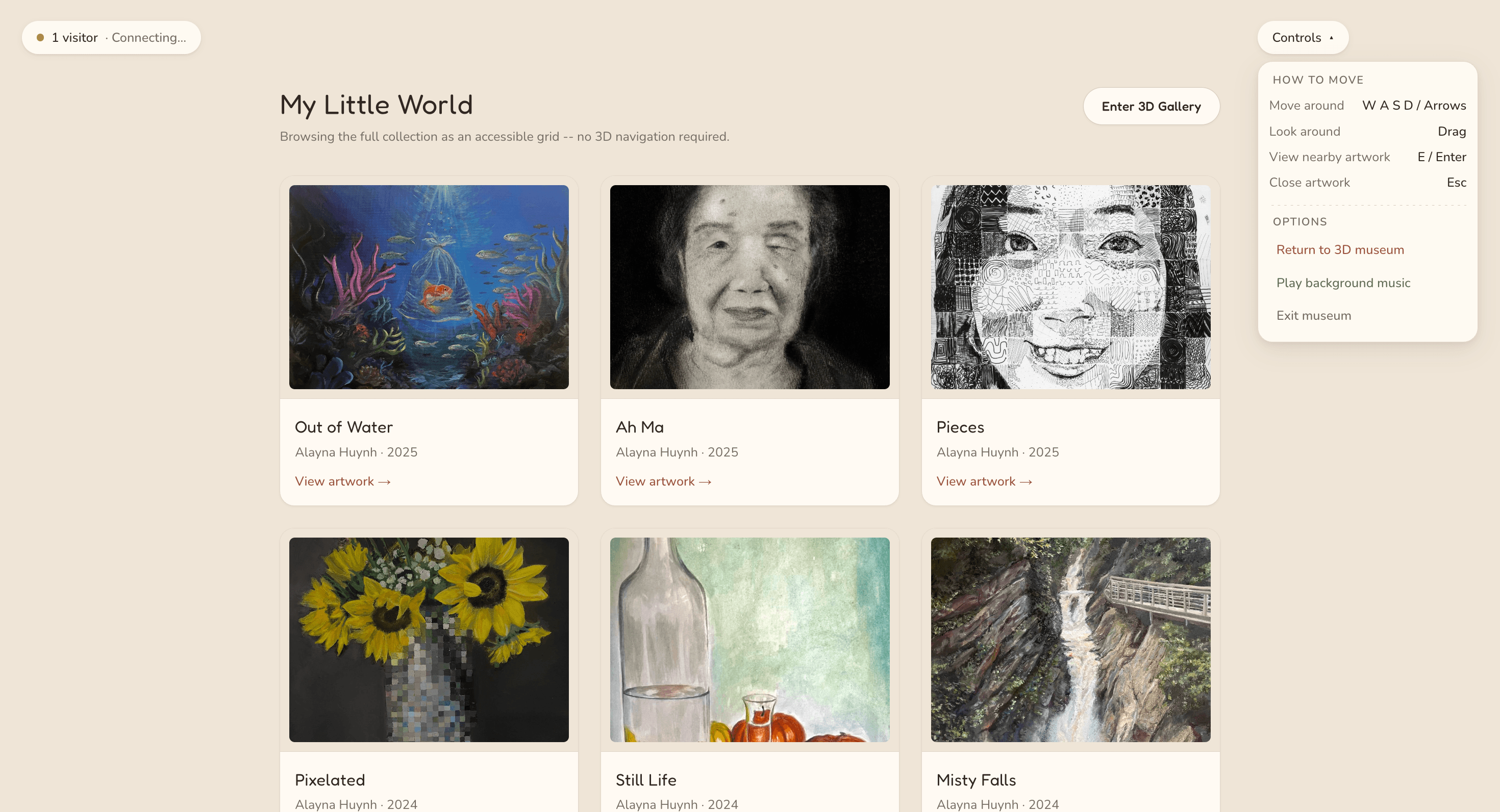
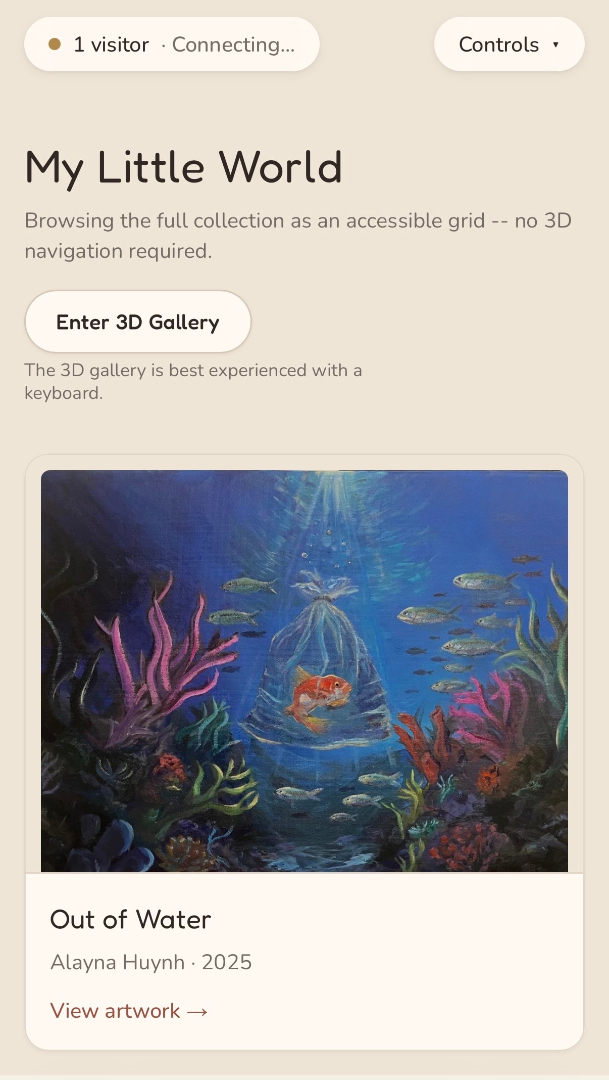
Pair the 3D gallery with a Grid View of the same collection and the same artwork viewer. On touch devices, Grid View is the starting point and Enter 3D Gallery stays one tap away.

Tradeoff
Mobile visitors don't start in the immersive experience that makes MyMuseum distinctive. I chose reliable access to every artwork over a first impression that might not work on their device.
Outcome
Built: no artwork is 3D-only. Grid View was checked at 390px wide, and the artwork viewer with keyboard only.
Accessible grid view of a museum's full collection as cards with thumbnails, titles, and View artwork links, with an Enter 3D Gallery button.
Grid View: the full collection with the same artwork viewer, no 3D required. Enter 3D Gallery stays one tap away.
Grid View on a phone: the museum title, an Enter 3D Gallery button, and a single column of artwork cards with View artwork links.
On touch devices, Grid View is the starting point.

Decision 03 · Social presence vs. social pressure

Design for presence, not engagement

The problem

Multiplayer could make galleries feel alive — or, with likes, follower counts, and chat, turn them into another social feed.

Evidence

  • Competitive analysisNew Art City's built-in chat showed that social presence was worth keeping.
  • Design intentI wanted artists to share work without likes, follower counts, or pressure to post. This started as my own goal; in later interviews, P4 described feeds reducing a series to scroll, double-tap, and forget.

Decision

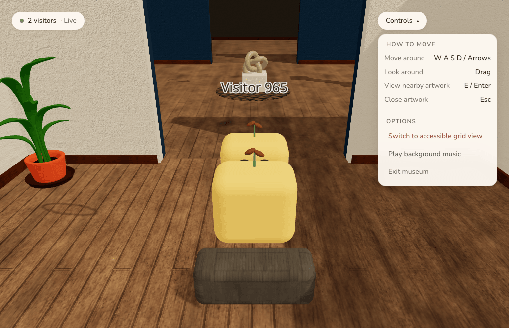
Show other visitors as labeled avatars and a live count — no chat, likes, or follower counts. For anything more personal, visitors can leave the artist an async note through Museum Mail, which artists can switch off.

Tradeoff
Visitors can't talk to each other in real time the way they can in a chat-first space. I traded spontaneous conversation for a calmer room where the artwork stays the focus.
Outcome
Built: realtime presence, verified across two live sessions, and Museum Mail. Public multiplayer deployment is still to come.
Two visitor avatars, one labeled Visitor 965, standing together in a gallery doorway with a live visitor count in the corner.
Two live sessions in the same room: Visitor 965 sees a second visitor arrive, with the live count in the corner. The other screen showed the mirror image.

Design

The final product

Organized around what each screen lets someone do, with mobile versions where the flow carries over.

01 — Walk through the gallery

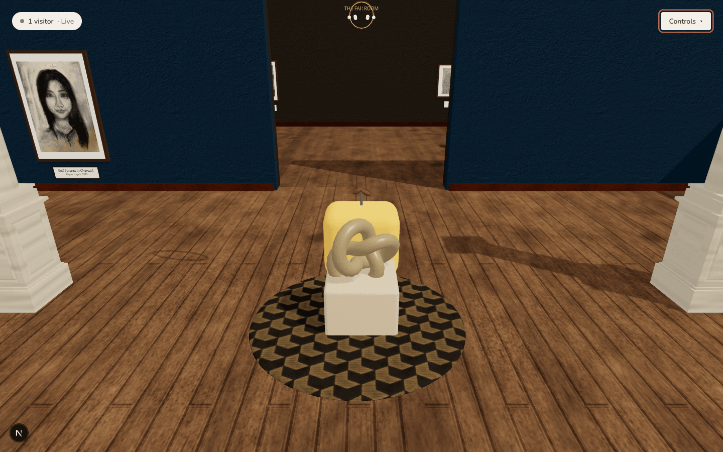
Third-person navigation between rooms, with a prompt the moment artwork is close enough to view.

Symmetrical museum threshold framed by white columns, leading into a room labeled THE FAIR ROOM with a sculpture on a plinth ahead.
Arriving at a room threshold.
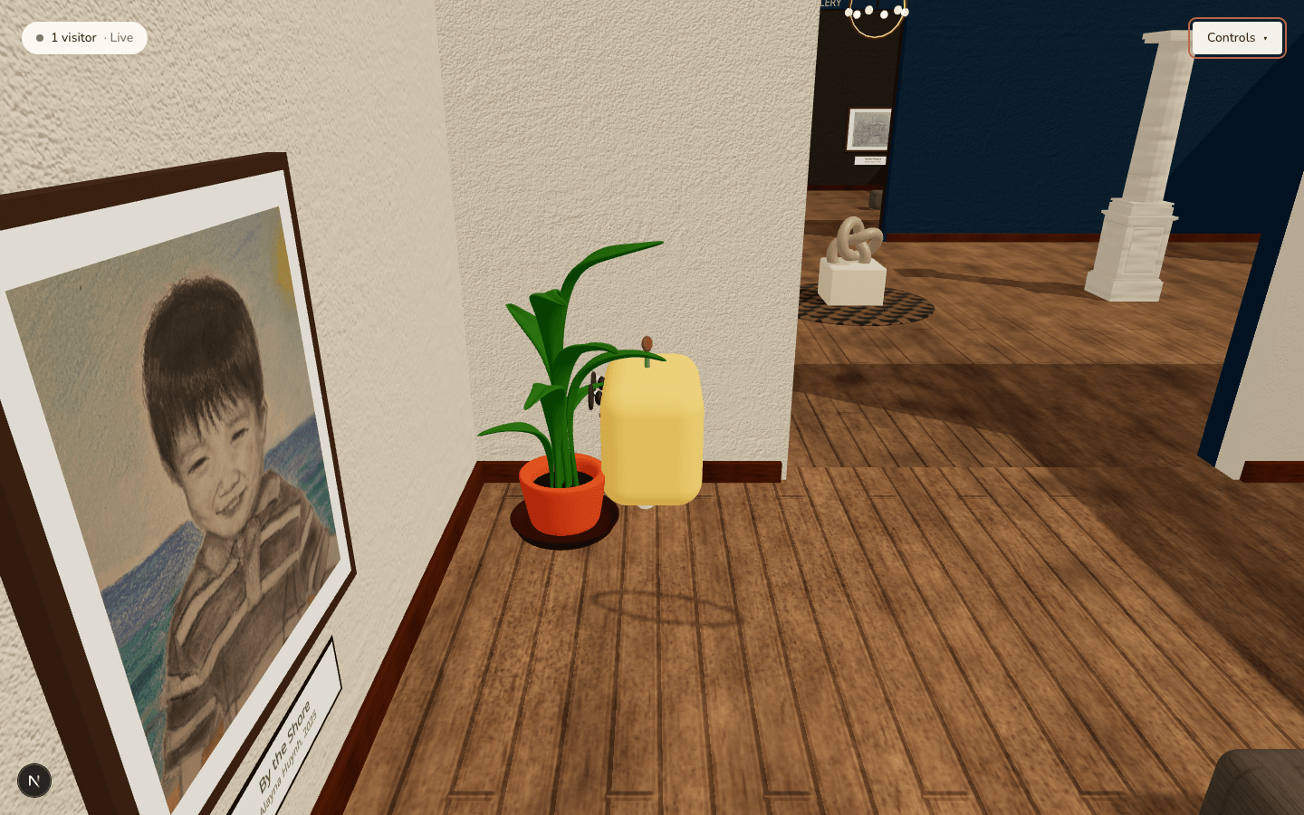
Wide view down the west wing of the museum, showing a framed portrait, a sculpture, and a second gallery visible through an archway.
Looking down the west wing into the next gallery.
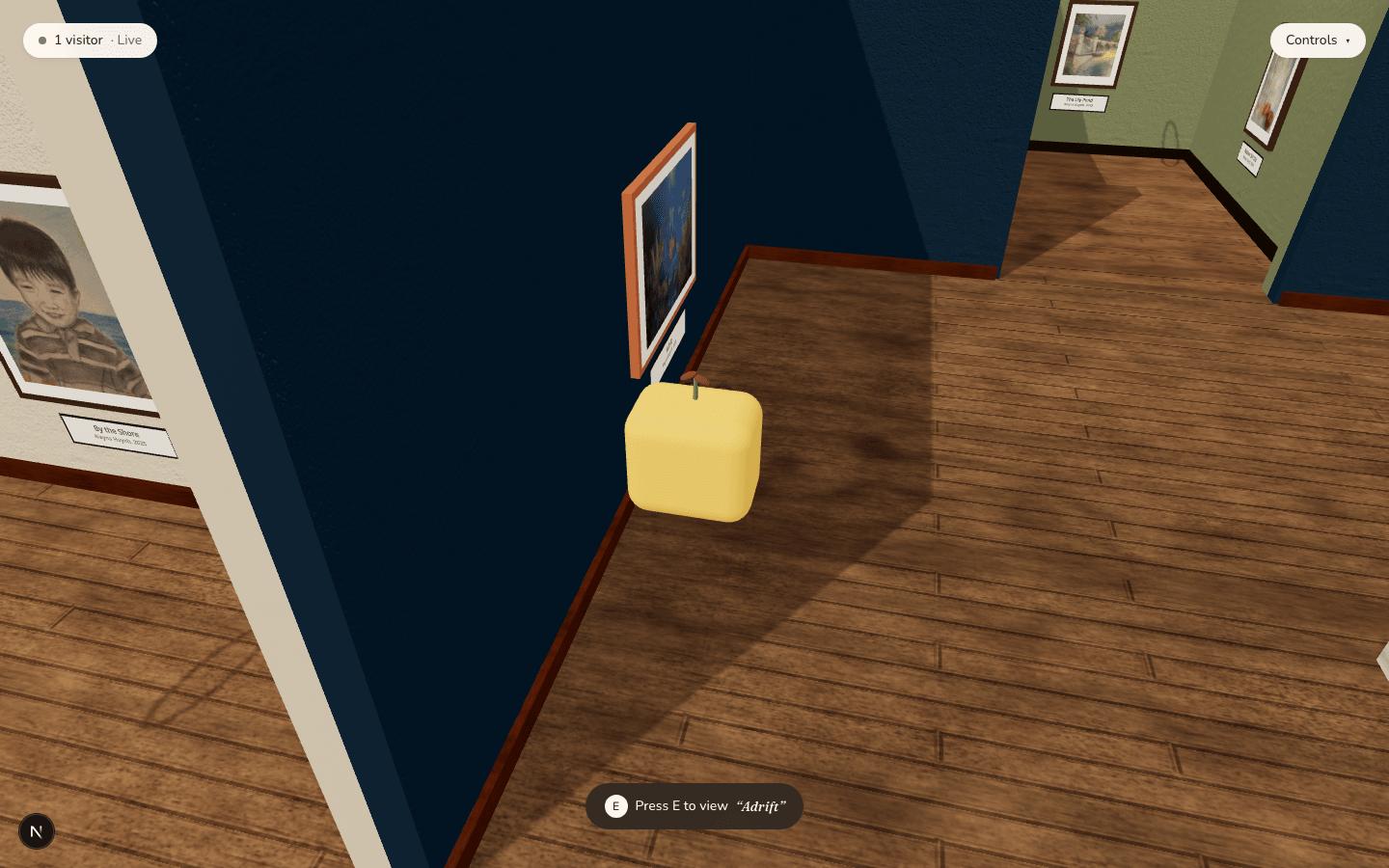
An avatar standing beside a hung painting with a 'Press E to view Adrift' interaction prompt at the bottom of the screen.
Artwork opens on a deliberate action, not just by walking past it.

02 — Inspect a piece up close

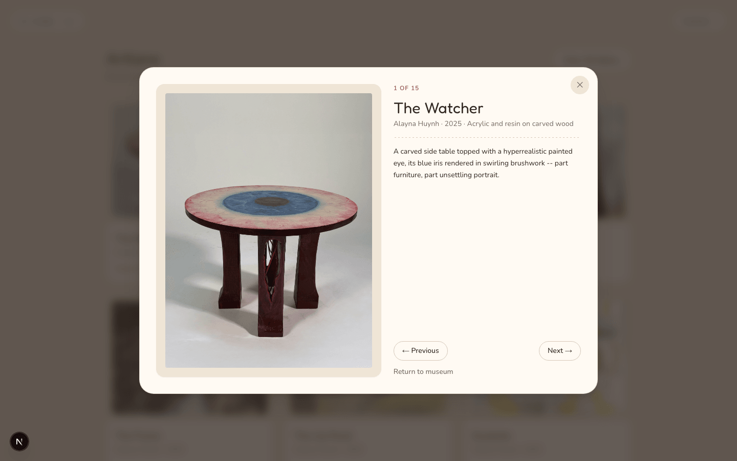
Stepping up to a piece opens a focused viewer with its full details, and Previous/Next carries that same viewer through the rest of the collection.

Focused artwork viewer showing 'The Watcher,' a carved side table with a painted eye, its title, medium, and description, numbered 1 of 15.
Title, medium, and description, with Previous/Next through all 15 pieces.

03 — Browse an artist's collection

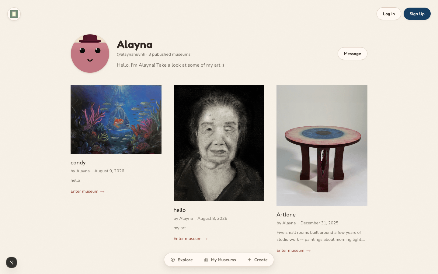
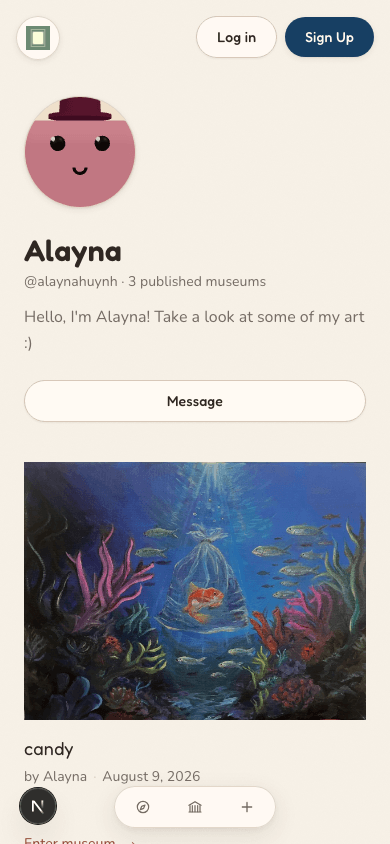
A public profile lists every museum an artist has published, each opening straight into that museum.

Artist profile page for Alayna showing an avatar, bio, and three published museum cards with Enter museum links.
The same artist profile reflowed into a single mobile column, museum cards stacked vertically.

04 — Give every visitor an identity

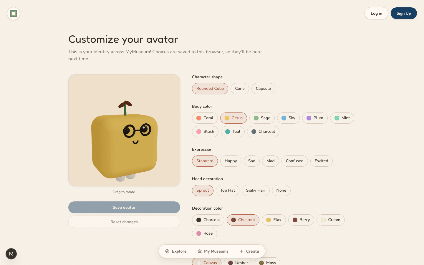
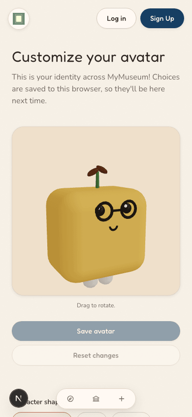
A drag-to-rotate avatar builder — shape, body color, expression, and decoration — so exploring a museum never feels anonymous, on desktop or mobile.

MyMuseum avatar editor showing a rounded-cube character with glasses and a sprout decoration, with body color, expression, and decoration controls beside it.
The same avatar editor stacked into a single mobile column, with the character preview above its customization controls.

05 — Write to the artist

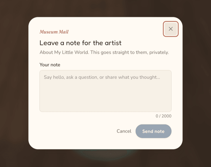
Museum Mail lets a visitor leave the artist a private note about a museum or a specific piece — from the artwork viewer, the in-museum menu, or the artist's profile. It works like email, not chat: no typing indicators or live replies; artists answer from a dashboard inbox on their own time. Artists can switch off new notes, but conversations already underway stay open. Recipients can block a sender entirely, and any message can be reported.

Museum Mail composer, titled 'Leave a note for the artist': 'About My Little World. This goes straight to them, privately.', a note field with a 0/2000 character count, and Cancel and Send note buttons.
Leaving a note from inside the museum.
Or about a specific piece, from the artwork viewer.

Testing & iterations

Self-testing the product loop

This isn't usability testing with users — that's the next step. As MyMuseum grew from a 3D prototype into a persistent product, I ran the full creator and visitor workflows myself, with real accounts, stored artwork, publication states, sharing, and multiple users. Two findings shaped Decisions 01 and 02 above; the rest are below.

  1. Create, edit, publish, and share a museum using a real creator account.
  2. Open the same museum anonymously and from a second account to check visibility and ownership.
  3. Run creation, editing, sharing, 3D, and Grid View on desktop and mobile.

01

Making sharing discoverable

What testing showed

Permanent museum URLs technically existed but creators did not have an obvious way to retrieve and reuse them.

What I changed

Added View Museum and Copy Link actions to the dashboard and editing flow.

02

Reducing artwork editing overload

What testing showed

As collections grew, displaying every artwork's full metadata form created an increasingly long and difficult-to-scan editing experience.

What I changed

Redesigned artwork management as compact summary rows with expandable editing.

Technical note — Fixing a share link that looked correct but failed

The generated URL was using a placeholder domain rather than the browser's real origin. Separated relative internal navigation from browser-resolved absolute sharing URLs so copied links work consistently across environments.

Final thoughts

“Building an exciting interaction and building a usable product are different problems.”

What I learned

The original challenge was making a 3D museum work. The harder questions came later: how creators manage museums, how visitors reach them on any device, how sharing behaves with persistent data, and how presence supports the artwork instead of distracting from it.

Opportunities & next steps

First, task-based usability sessions with artists and visitors on the live product — the step the interviews didn't cover. Then the two gaps the interviews made clearest: artwork zoom with measured load times (P2, P3), and showing a painting's real-world scale (P1).

What I'm most proud of

Turning an unusual interaction concept into something creators can actually return to, manage, and share — not just a visually impressive prototype.