Product Design · UX Audit · Website Redesign
Vietnamese Noodle House
Rebuilding a family restaurant's website so it finally works as hard as the food does.
Vietnamese Noodle House is a family-owned restaurant with two physical locations and a food truck around Syracuse, NY. Their old site broke on mobile and looked nothing like the restaurant it represented. I audited it, then designed and built a new one — a warm, photography-forward identity across every page, with a clearer path to ordering from the right location.
- Year
- 2026
- Duration
- Ongoing client engagement
- Role
- Solo UX/UI Designer & Developer
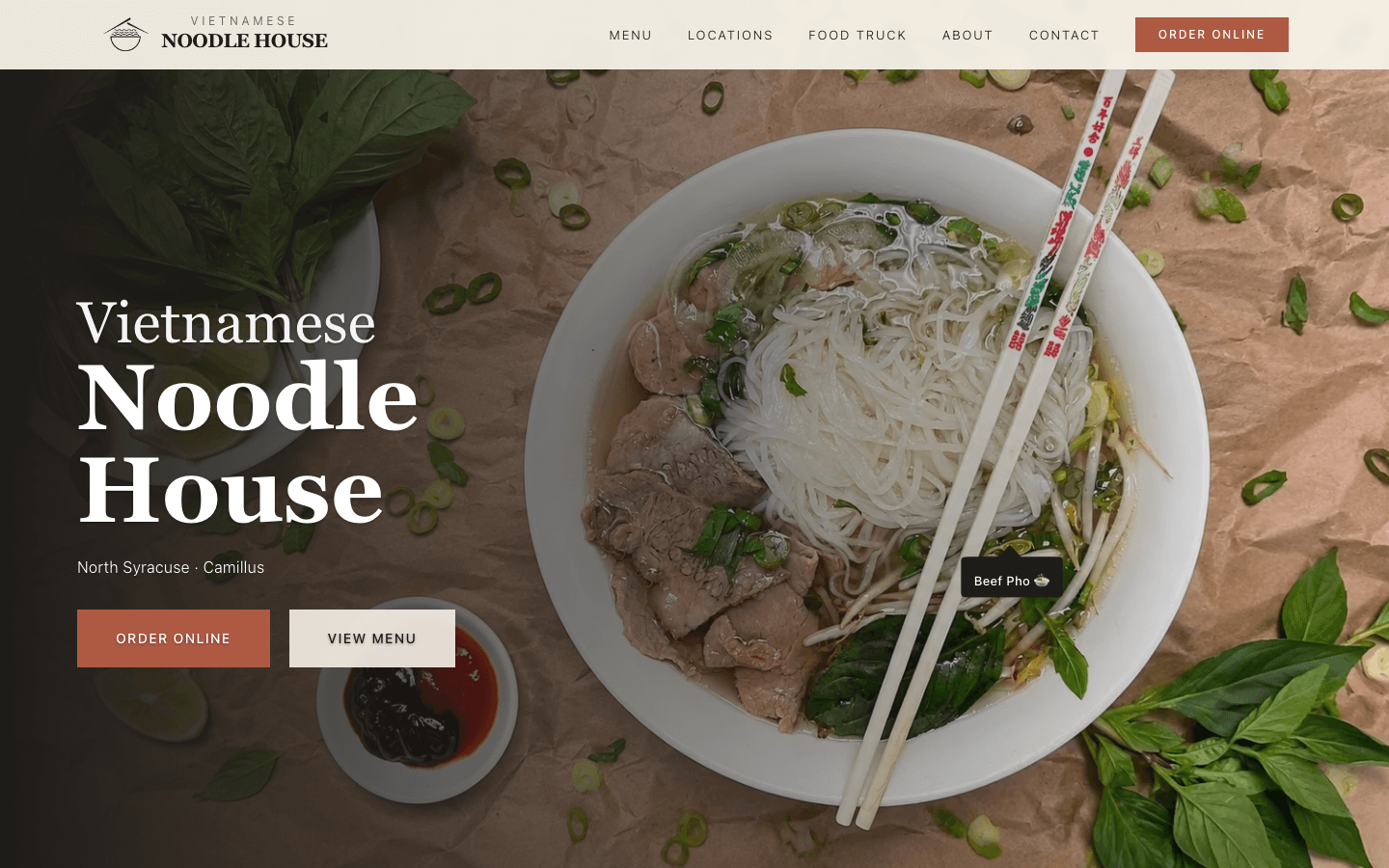
Desktop
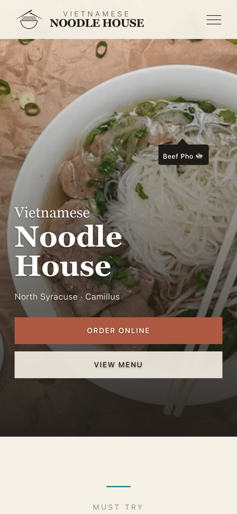
Mobile
Overview
A full rebuild across Home, Menu, Locations, Food Truck, About, and Contact.
Client
- A family-owned restaurant with two locations — North Syracuse and Camillus — and a food truck.
My role
- Solo — I audited the old site, then designed and built the new one across every page, desktop and mobile.
Constraint
- Online ordering stays on the restaurant’s existing ordering platforms (MenuDrive/Lavu), with a separate link per location — the site has to route people to the right one.
Status
- Live at vietnoodlehouse.com. Real-world impact hasn’t been measured yet.
The problem
The old site was actively working against the business
The old site wasn't mobile-responsive: on a phone the layout broke, text was unstyled, and the hero image was broken or showing a placeholder. On desktop it was usable but generic — a dated layout with a visual identity that said nothing about the food or the family behind it. For a restaurant that depends on people finding it, trusting it, and ordering from it online, that gap between the real place and its website was a real cost.
Old site — Mobile
A broken logo, a gray box where the hero photo should be, and unstyled buttons.
Audit
Auditing the live site
There was no separate discovery phase to run — the old site was live, in front of real customers, and visibly failing them. So the audit doubled as the research: a heuristic review of the desktop experience, and a full pass on mobile, where the failures were worse.
Self-directed UX audit across desktop and mobile breakpoints — not participant usability testing.
01
Two look-alike ordering buttons
The homepage's main actions were two ordering buttons — "Camillus" and "N Syracuse" — styled identically except for border color, with no address, hours, or map beside them. A customer had to already know which town their restaurant is in.
Each button opens a different location's ordering page — and the owners told me customers were already placing orders at the wrong location.
What I changed
Location cards with address, map, and hours, then a confirmation that repeats the address before handing off to ordering.
02
The menu wasn't part of the website
View Menu just opened an 11-page PDF in the browser's PDF viewer. On a phone, the text ran off the right edge of the screen, and there was no way to jump to a category except paging through the document.
The menu is core content for a restaurant site, but as a PDF it couldn't match the site's identity or adapt to a phone screen.
What I changed
Rebuilt the menu as a real page — seven categories, ~50 items — with a sticky category nav that highlights where you are.
03
The mobile hero worked against the business priority
The heading sat directly on the brightest part of the hero photo with no scrim behind it, and a decorative callout tag crowded the headline — while online ordering, the actual business priority, wasn't the primary action.
If the highest-priority action isn't legible or isn't primary, the homepage isn't doing its one job.
What I changed
Order Online promoted to the primary filled CTA, View Menu made secondary, a scrim added behind the heading, and the callout tag repositioned.
04
Content gaps read as unfinished
The About page was text-only with a large empty gap on desktop, and the footer emphasized the abbreviation "VNH" over the restaurant's actual name.
Empty space and an unclear name both read as an unfinished site, not a considered one.
What I changed
Added real photography to About and rebalanced the footer around the restaurant's full name.
05
"Message sent!" wasn't true
The contact form displayed a success message on every submission, but the email was never actually being delivered anywhere.
A contact form that silently fails is worse than no contact form — it tells the business every message got through when none did.
What I changed
Rebuilt the form to actually send via Resend, and to fail honestly and visibly if it's ever misconfigured again.
The identity I wanted the redesign to earn
01
Warm, not generic
A cream, terracotta, and teal palette with a serif display face paired against a clean sans body — editorial, not templated.
02
Photography-forward
Real photography of the food and the locations carrying the page, instead of a stock-feeling layout doing the work alone.
03
Mobile gets equal care
Every page designed and refined at both breakpoints together, not shrunk down from desktop as an afterthought.
Centerpiece — interaction design
Making sure every order reaches the right kitchen
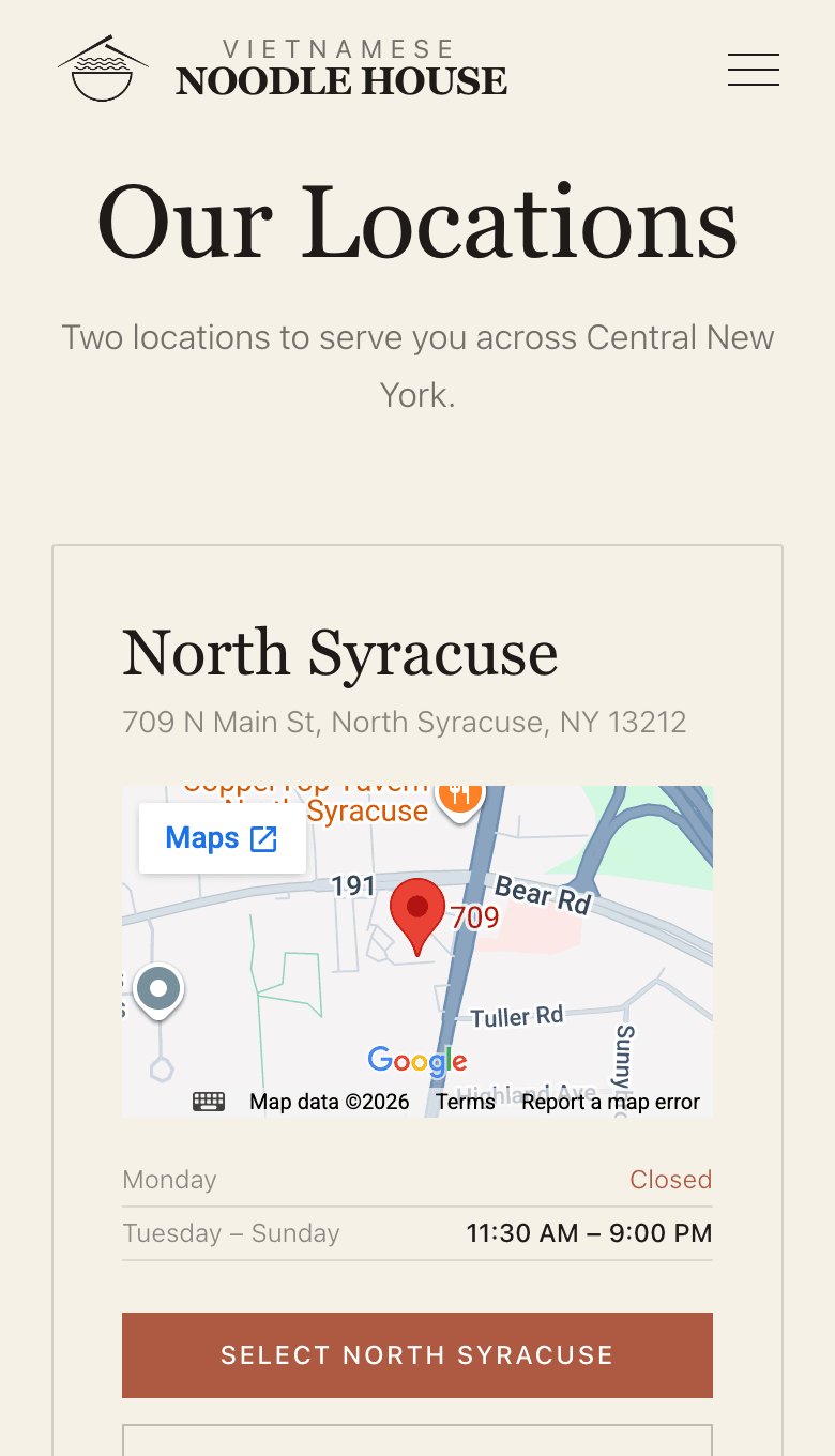
Each location has its own ordering link, and the old site asked customers to choose between two town names with nothing else to go on. The owners told me customers were already ordering from the wrong location. I designed a select, then confirm flow: each location card shows the address, a map, and hours, and choosing one repeats the address back before handing off to ordering.
Before — old site
Two dark pills that differ only by town name and border color — no address, hours, or map to tell a customer which restaurant is theirs. Each opens a different location's ordering page.
After — Desktop
Step 1 — Select a location
Step 2 — Confirm
Desktop has room to show the confirmation inline, right below the card grid — a natural next step in the same view.
After — Mobile
Step 1 — Select a location
Step 2 — Confirm
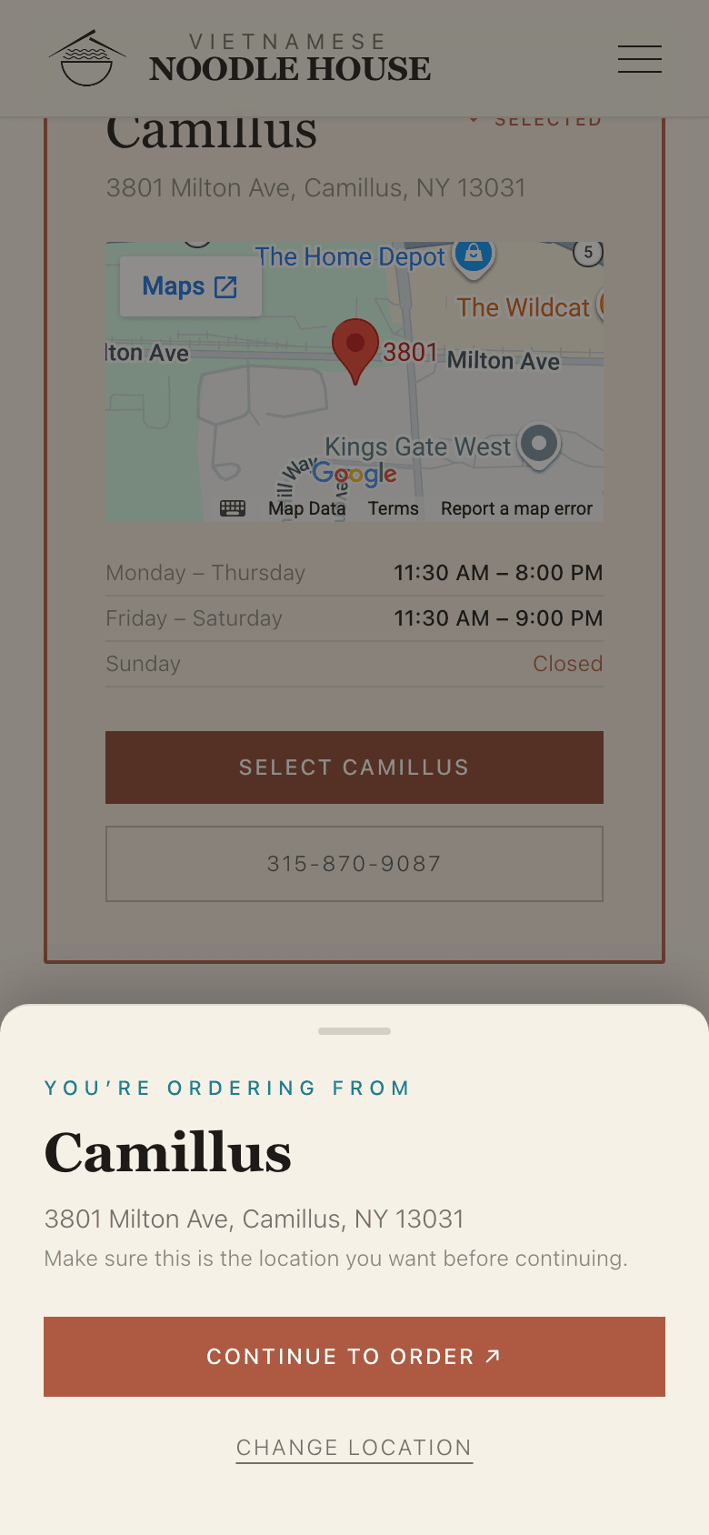
On mobile, a second full card stacked underneath read as duplicated information rather than a next step. So I redesigned this step as a bottom sheet that covers the list instead of extending it — the same information, but a sequence that’s actually clear on a small screen.
Desktop had room to show the confirmation inline below the grid; mobile needed a different pattern entirely.
The tradeoff
Ordering online is the business’s top priority, and this flow adds one confirmation tap in front of it. I accepted that because wrong-location orders were already happening, and each one costs the customer and the restaurant far more than a tap — the extra step is a single button that already names the location they picked.
How I’d know it worked
I haven’t measured it yet. The owners’ reports are the baseline: the next step is location-level analytics on the hand-off, plus checking with them whether wrong-location orders have dropped.
From PDF to a real menu
The menu wasn’t part of the website — it was a PDF
On the old site, View Menu simply opened an 11-page PDF in the browser’s PDF viewer. It didn’t share the site’s design, didn’t adapt to a phone, and the only way to find a dish was to page through the document.
Before — old site
On a phone, the PDF's item descriptions run off the right edge of the screen.
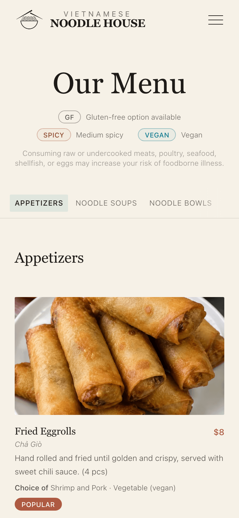
I rebuilt it as a real page: seven categories and ~50 items, with photos and dietary tags. Rather than paginate it, I added a sticky category nav with scroll-spy auto-highlighting, so the current section is always visible no matter how far down a customer has scrolled.
After — Desktop
After — Mobile, top of page
After — Mobile, sticky nav mid-scroll
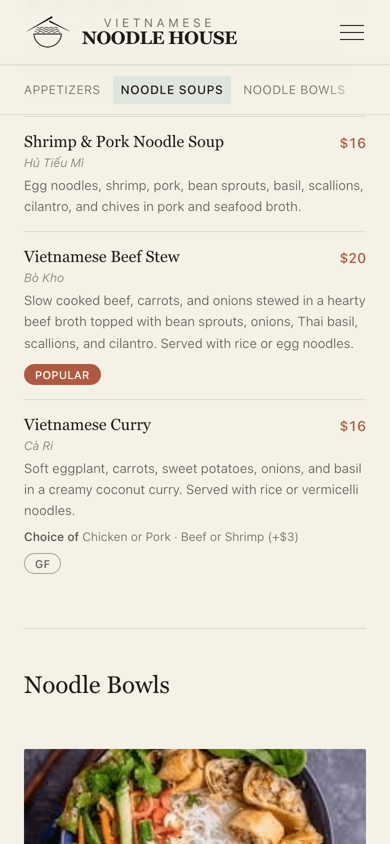
As the page scrolls, the nav pins to the top and the active category updates on its own.
Visual identity
A homepage that looks like the restaurant
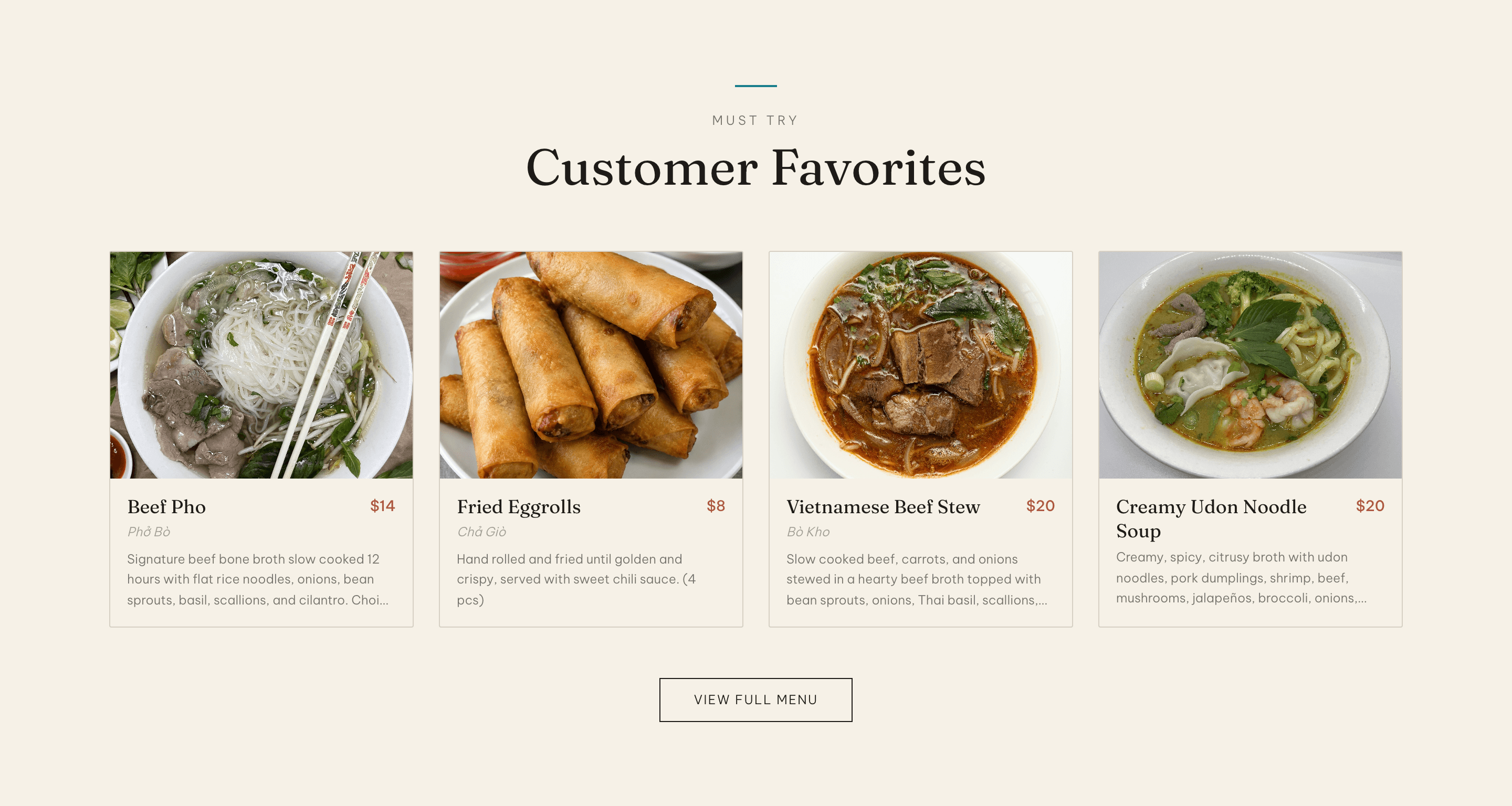
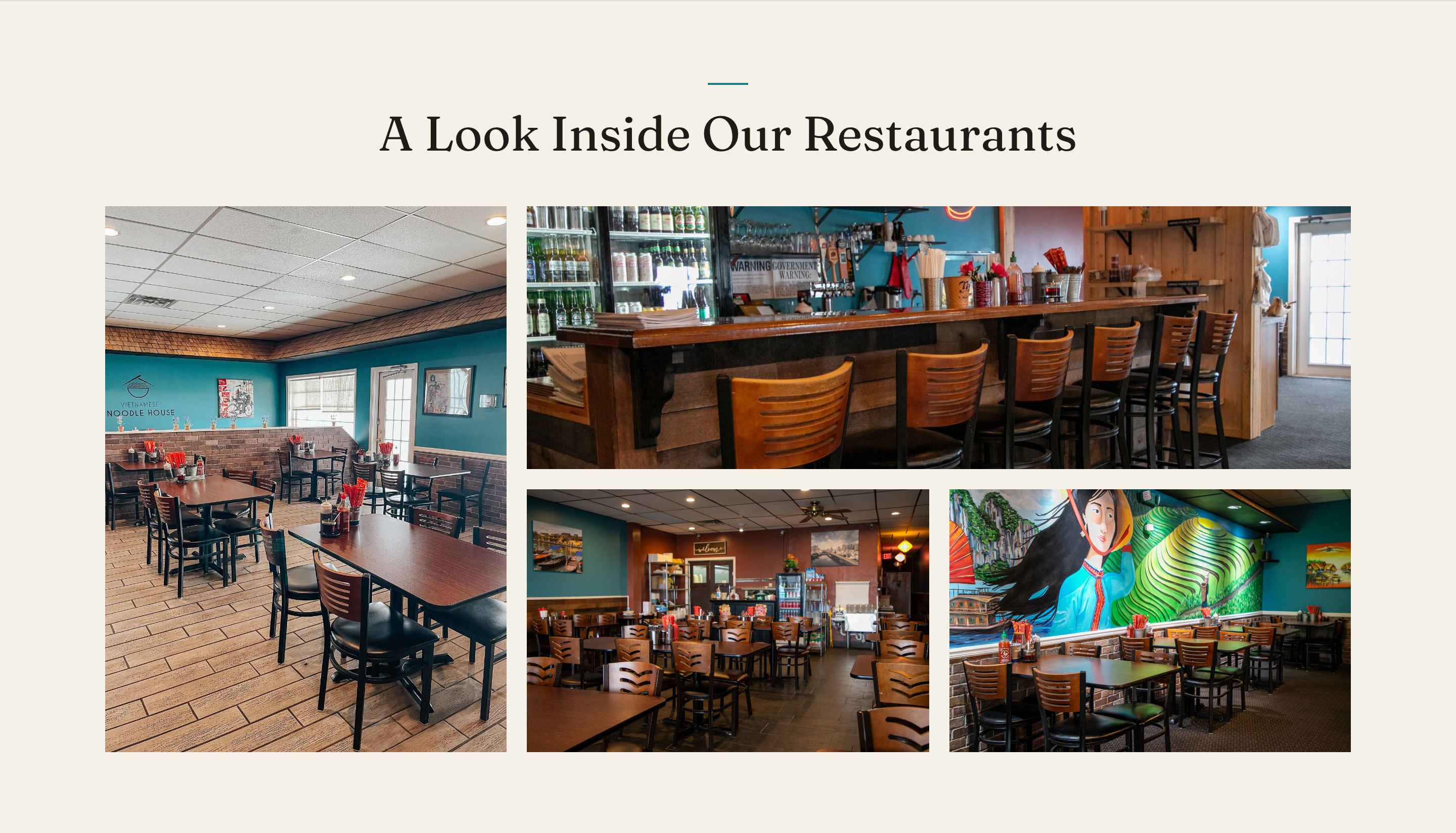
Photography does the talking — the food and the people, not stock imagery or generic layout tricks. Order Online is the primary filled action on every breakpoint; on mobile I added a scrim behind the hero heading, which used to sit on the brightest part of the photo, and moved a callout tag that was crowding it.
Other pages
Smaller fixes that made the site feel finished
About — filling an empty page
The old About page was text-only, with a large empty gap on desktop. Real photography of the restaurant makes it read as considered rather than unfinished.
Food Truck — a page that didn't exist
The truck travels around Syracuse but had no page on the old site. I built one from scratch in the same identity, centered on where it'll be next.
Contact — a form that actually sends
It looks much like the old one, but the old form showed “Message sent!” without delivering anything. It now sends through Resend and fails visibly if it's ever misconfigured.
Reflection
Designing for clarity meant thinking beyond the visuals.
Working on Vietnamese Noodle House taught me that redesigning a website isn't just about making it look better. It's about understanding how people use it and making sure the experience works for both customers and the business.
One of my biggest takeaways was learning to think beyond the interface itself. Whether someone is choosing a restaurant location or submitting a contact form, a successful interaction should be clear, reliable, and easy to complete.
What I’m most proud of
Turning an existing restaurant website into a more cohesive, responsive experience while working around real business and ordering-platform constraints.
What's next
Now that the redesigned website is live, I want to understand how customers are using it. My next steps are gathering feedback from the restaurant owner, evaluating the location-selection experience on mobile and desktop, and identifying opportunities to improve the site based on actual usage.